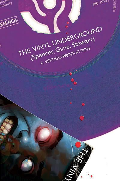
Book of Doom: Vinyl Underground #1
 So I chose this as this week’s Book of Doom because I wanted to try something new and the write-up seemed intriguing. Solving mysteries, in London, weird stuff, sounds good.
But I didn’t really like it. The characters’ edginess seemed so forced. Troubled celebrity, drug-addict, porn-tease. Maybe that’s a statement on society itself, that those things would make me yawn, but they just seemed like mascots for their descriptions rather than characters with issues.
So the Bloodhound Gang solves crimes and feeds the answers to the bald lady cop. But in this new crime, it just so happens that the main character happened to date a girl who knows exactly the right people, places and things. A convenient coincidence like this seems like it’s straight from the pages of Green Lantern: Year One. GAYO!
The art was okay, but just seemed way too cartoony for something that’s supposed to be dark and occult-ish.
There just wasn’t really anything in here that worked for me. I have no interest in anything in this book at all. So that I’m not all Doom and Gloom, I’ll try to think of some things that were good about this comic.
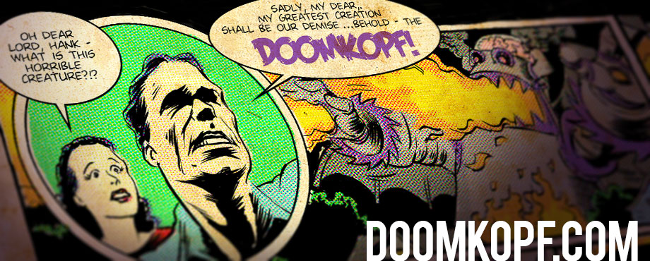
– The cover was neat.
– Boob shot
– The girl torched an attacker. That was kind of cool.
– Being a “mature” title, my comic shop bagged and boarded it for me for FREE!
– It wasn’t Howard the Duck #1.
Jean Claude Van Doom
I read this issue, re-read it, thought about it awhile, and I’m still not sure if it’s any damn good. I like the premise, as it’s hard to go wrong with weird voodoo detectives. I like the setting, though it’s been done better elsewhere (see Mike Carey and Alan Moore for further). I liked the general tone of the book (more playful than edgy), and I liked the authentic British dialogue.
But it feels like a story that doesn’t quite know what it wants to be yet. Is it a more youthful Hellblazer? A more realistic Shadowpact? The creators seemed to straddle so many genres that they just ended up legs splayed, trying not to topple.
There were more concrete problems, too. The art was stiff and a bit cutesy. A more abstract feel could do wonders for this story. I would’ve been happy, too, if the writer hadn’t gone with the force-feeding of exposition throughout the first pages. Lazy writing shows worst in such moments.
I know it’s hard to do a great first issue and really get across all the potential that a series has, and I’m definitely open to the idea that this could evolve into something good, but issue #1 just didn’t do it for me. Even the mystery of the dead little boy wasn’t given enough importance for me to care about the outcome. Not that I don’t care about little children dying, but we’re not given enough to make us especially invested in this one.
As far as Vertigo series go, I’d say Vinyl Underground looks like another American Virgin: great concept, rocky execution.
As a side note, I love how Vertigo is using the non-glossy paper. Like Jim has said, this reminds me of what it was like to read comics as a kid. However, I’m pretty sure this paper is cheaper, so why did this book still cost $2.99?
Fin Fang Doom
Well that just wasn’t very good.
Let’s count the cliches, shall we?
1. The private eye who’s a thorn in the side of the police detective.
2. The ex-girlfriend being thrust back into the lead character’s life.
3. Detectives having to solve a crime in order to clear someone close to them who has been falsely accused.
4. The hot girl that can take care of herself.
5. The screw-up who turns his life around.
6. The enemies being forced to team up for some reason.
A lot of these might be forgivable if writer Si Spencer had been able to turn any of these “beautiful but broken characters” (as he so arrogantly puts it in his editorial) into three dimensional personalities, but he hasn’t. Any character that can be completely summed up by a one-page nutshell description can’t have much depth to them.
Every character leading a double-life could be interesting if these lives were secret identities of sorts, but they aren’t. The chick (I didn’t catch any of the characters’ names) just happens to be a porn star, not because it helps her in cases or she uses it as a cover. So why does she have to be a porn star? What does that add to the character or the story? Why waste a full page splash on something so trivial? Just to get a few T & A shots into the book?
And Emo Boy just annoys the hell out of me. That’s got to be one of the most generic, unoriginal character designs I’ve ever seen. I seriously can’t even stand to look at the guy. According to the little blurb in the back, artist Simon Gane is an “indie sensation,” but I’m hard-pressed to see why. His art looks pretty much like every generic comic artist of the last five years. It’s not bad, but it’s certainly not sensational.
The idea itself really wasn’t that bad. A private detective agency specializing in cases the regular police just can’t seem to crack is by no means an original idea, but it’s been put to good use in many other formats to tell compelling stories. I’ve seen this same story over and over again, with a different cast of characters and a different creative feel, and it can work.
But Vinyl Underground doesn’t.
My former boss is slowly rolling out his new online comics project and I thought you guys might be interested.
http://www.brianalvey.com/2007/10/06/building-a-great-online-comic-book-reader/
Thanks for the tip.
Back to the issue, I went back and read the writer’s note. Man, now I’m pretty sure I hate this book. Also, he doesn’t have any idea what autism is. When a guy occassionally floats in the air, foams from the mouth and predicts crimes, he’s possessed, not afflicted with autism.
Oh wow, I didn’t even read that writer’s note.
I would really like to read the book he’s describing! Too bad it isn’t the one he wrote.
I enjoyed the nudity and vulgar language.
So, we pick a good book for Book of Doom every, what, two months? Are we idiots or do comics suck?
Well, while I think both of those factor in a bit, a lot of us also try to pick something new (to us). So maybe a fairer assumption would be that, out of the books that are new or as-of-yet undiscovered by our individual members, there’s not a lot of good stuff coming out.
But then also factor in the general displeasure that many of us are having with the books we do regularly buy, and then I think one could fairly argue that comics are, overall, sucking.
The follow-up, then, would be to ask, is that new? Was there ever a time when all of us were liking everything we bought?
When I first started coming back to comics in about 2002 (is that right?), I remember being impressed with the quality of comics. But two things probably factor into that. I’m sure that at the time I had fresh memories of how awful comics were when I gave them up in the 90s. Also, I bought a select few books then, and really only the ones that were generally thought of as quite good.
When I wrote the above, I was thinking about the exact same period, and I remember thinking how much the X-Men books sucked but I kept buying them anyway.
Ultimate X-Men was good and everything else was horrid. I didn’t buy the sucky ones.
Of course, when was the last time that Uncanny or regular X-Men was actually worth a darn for any extended period?
Regular X-Men was worth a damn when it was New X-Men, but other than that I can’t think of a time in the 12 years I’ve been reading the title when it was really good.
I think comics right now are sucking because we’ve been spoiled a little bit. Infinite Crisis was awesome, which just so happened to be the first time I started reading DC Comics. That’s a really hard act to follow. Marvel’s completely ruined the impact any of their mega-crossovers could have by starting a new one every three months. The Ultimate Universe isn’t fresh anymore. I think comics are worse now, but only compared to what they were two or three years ago.