Digging through the dirt
This weekend, I undertook a big project – integrating the randomly-stored comics from my youth into the alphabetized comics I’ve purchased since returning to the life of a comic book reader. I just wanted to share a few thoughts and observations from the dig.
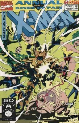 – I liked how, back in the early 90s, it was the norm to have crossovers in annuals (not to mention it was the norm to have annuals). “Kings of Pain” crossed over between New Mutants, New Warriors, Uncanny X-Men and X-Factor in 1991; “Shattershot” was in the four mutant books in 1992; “The Von Strucker Gambit” was in Punisher, Daredevil, Captain America and something else in 1991. Back then, I was at the mercy of whatever came to the local drug store, so it was exciting to be able to read these big crossovers.
– In the early 90s, I think every comic book was illustrated by either Andy Kubert or John Romita Jr. Between the two of them, you’ve got Uncanny X-Men, X-Men, Ghost Rider, Spirits of Vengeance, Punisher, Cable, Avengers, Amazing Spider-Man, and I’m sure I’m missing a few.
– Mark Texeira could make anything look cool. Most of what I bought of his was in issues of Ghost Rider, Wolverine and the Sabretooth miniseries, but he even made an issue of Guardians of the Galaxy look awesome.
– I bought way more Guardians of the Galaxy than I remembered.
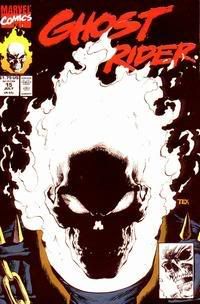 – Ghost Rider seemed to have some kind of gimmick about every other month. #15 had a glow in the dark cover (which was cool). #25 had a pop-up centerfold (kind of weird). #28 was polybagged with a special poster inside (do I open it?). So was #31 (yeah). #40 had a weird solid black cover of some kind of different paper (huh?). I stopped reading not long after that.
– Even Ren & Stimpy #1 was polybagged with some insert or another.
– I love watching artists evolve, but I think someone abducted Leinil Francis Yu and took his name. I was amused to see that Wolverine #120 from January 1998 was written by Warren Ellis and Leinil Francis Yu, two names that surely meant nothing to me when I bought it (and I’m not even sure why I picked this up or how picked this up, since I wasn’t even living in the USA at the time). But while Yu’s current work ranks among some of my favorite art ever, he had a pretty stiff and generic style back then. You can see some Whilce Portacio influence in some of the faces, but it was quite clear he hadn’t found a style that was “his” yet.
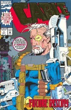 – Remember back when superficial changes were a huge deal? There was this big issue of Wolverine where he got a buzz cut and shaved the sideburns (#59). The Punisher turned black for a few issues (around #60). Cable got a new series for his “goatee years.”
– Image was putting out so much crap, and I was buying it. I can’t believe how many different things Rob Liefeld could start. These included, but were perhaps not limited to, Youngblood, Youngblood: Strikefile (because the fans demanded a spin-off after 1 successful issue), Brigade, Supreme…there might have been more but that’s all I was suckered into. I also found an issue of an Image comic called “Wildstar” – it’s a guy in a spandex bodysuit with a starfish stuck on his chest.
– Perhaps the worst legacy of the Image creators was all the imitators they spawned. As much as I dislike Rob Liefeld’s art style, at least he knows his style and he’s pretty consistent with it. The post-Liefeld issues of X-Force are hideous (I’m talking Mark Pacella and Dan Panosian; Greg Capullo’s art was solid once he took over a few issues later, before he became a Todd McFarlane wanna-be). Same with the post-Jim Lee issues of X-Men and Uncanny X-Men (with Art Thibert and Brandon Peterson). While X-Cutioner’s Song was probably going to be something glorious and epic if Lee, Portacio and Liefeld had stuck around, it ended up an ugly mess.
Call me crazy, but I really prefer Leinel Yu’s early stuff to his current stuff. I’m only going off of memory, though, because I haven’t looked at that stuff in years. Of course, that preference may be based solely on the fact that A) his stuff actyually came out back then (unlike Ultimate Hulk vs. Wolverine) and B) it wasn’t written by Bendis.
To refresh your memory, here are two clips from nine years apart, showing Wolverine and another guy just talking.
Leinil Francis Yu, Wolverine #120 (1998):
Leinil Francis Yu, New Avengers #28 (2007):
As for your other two points,
A) coming out with a book a month is good enough for me. I’d love for him to do more, but I’m pleased with a monthly schedule (plus the occasional bonus book like Fallen Son).
B) why am I not surprised that you would judge art based upon who wrote the words?
Does Yu not have his pencils inked anymore before they’re colored? I’ve never liked that.
“B) why am I not surprised that you would judge art based upon who wrote the words?”
Well, when there’s so many words that they start to cover up the sweet artwork, you’ve got a problem. 😉
Yu is just plain ol’ sweet these days, compared to decidely generic back then.
Also, I bought that whole Guardians of the Galaxy series too. Man, I loved that book. For shame.