Worst to First: 9/26/07
You thought last week was bad? Out of a measly five books this week, two are getting dropped, one is getting re-dropped and one was an annual that I almost didn’t buy (and probably should’ve skipped). There comes a certain point when I think of what else I could do with $17, and it gets my mind to roaming somewhere far beyond the comic shop. So, now that you’re good and depressed, on to the reviews!
Worst: Killing Girl #2
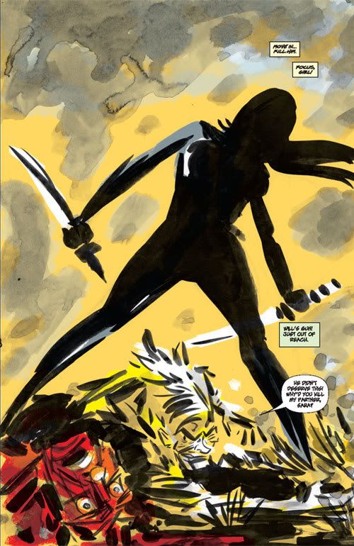 First, just look at this artwork. Soak it in. You aren’t going to see anything like it anywhere else. Rocketo’s Frank Espinosa comes through with another splash-page-of-the-week and shows a further development of his style with the watercolor-highlighted background. Cool stuff.
However, it pains me to say this, but I thought much of the rest of his work in this issue had an unfinished feel to it. A bit scattered and distracted. But then maybe that’s just my subconcious polluting the art because of the story’s failures. As far as in-the-head-of-the-killer works go, this is a far cry from the classic The Killer, and everything’s just to neat and clean, unnaturally so. Hate to say it, but no matter how much I love Espinosa’s art, I won’t buy a book just for it.
Yawn: JLA #13
There is absolutely nothing original in this book. For further complaints, come back Saturday and take part in our Book of Doom roundtable.
Treading water: Captain America: The Chosen #2
As a protest over the $3.99 madness, I was planning on not getting this book and waiting for the trade. But the folks at my new shop pulled it for me, even though I only wanted the regular Cap series. So I caved.
Speaking of caves, much of this story takes place in one. It’s scary and full of evil Arab caricatures. Ooooh! I’m starting to kind of worry about this series. After the big reveal at the end of issue one, we get a ton of emotional background on the U.S. soldier in Afghanistan, but it’s at the expense of any plot development. Again, even though I really enjoy Mitch Breitweiser’s art, I can’t justify $4 per issue for a story I don’t enjoy.
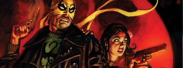 Almost awesome: Iron Fist Annual #1
Much like Daredevil #100, this issue did a great job of using the storyline to justify an artist medley in this tale of Danny seeking insider knowledge to help him win Mortal Kombat the Tournament of the Heavens. Particularly great is Dan Brereton’s work, seen above. It looks straight off the cover of a pulp novel, which fit perfectly the pulpy feel of Orson Randall’s escapades.
Aside from this book feeling a little too disconnected from the ongoing plot, what really dropped it in my mind was Howard Chaykin’s art. I know the guy is a legend and does some amazing work, but why does he feel the need to draw everything like it’s taking place in 1989? Holding his version of Danny Rand up to David Aja’s work makes me wonder if Chaykin even read any Iron Fist issues before doing the Annual. On a more positive note, kudos to Marvel for putting a note at the beginning so I knew to read Iron Fist #9 first.
First: Iron Fist #9
Now there’s a segue Jim Doom could love. This book had a pretty good fight, an expanded understanding of the past of the Iron Fist and the return of the Luke Cage and Heroes for Hire plot (though just barely). Nothing spectacular, but on a week like this, it doesn’t take much.
Random complaint: I really, really didn’t like how they included the name of every “attack” as the characters were fighting. It called to mind the bad video games this plot is ripping off, not to mention cartoons like Yu-Gi-Oh. Is it too late to scrap that style, or am I going to have to drop another book?