Does Michael Turner have an eating disorder?
Plenty of times in the past year, the big shots at Marvel and DC have been looking over their publishing schedule and seen an upcoming release – often one of the biggest books on the horizon – and decided the publication was so esteemed as to be deserving of a variant cover or special cover artist. And not once, not twice, but about twenty times, they opted for Michael Turner.
His most renowned art work looks a little something like this:
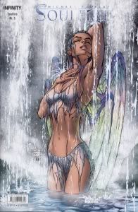 So, for some of the most crucial issues of comics on the docket, we get a big to-do made over a freaking Michael Turner variant? And, for whatever reason, this process has continued on and on, from Identity Crisis to Superman/Batman to Wolverine: Origins to Civil War. And, aside from creating Soulfire (if it’s in your buy pile, do you have to tell friends you “buy it for the articles”?), Turner now is making a career as a cover artist. He’s been handling a steady workload, sure, and that’s plenty impressive. I mean, I’d think I could only draw so much T & A before needing a break. But I certainly can’t fault the guy for his success.
I can fault the comic book companies for shoving him down my throat, though.
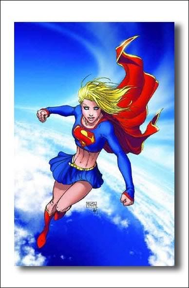 Take, for instance, Supergirl.
Turner managed to not overload her with breasts or strategically place her under a waterfall, but I’ve always thought there’s a difference between drawing in an abstract or unique style and drawing semi-realistic interpretations that only exaggerate anatomy. The chief architect of this form of artwork is Rob Liefeld, of course, who once addled Captain America with a four-foot deep chest.
Here, we get Supergirl with a waist only slightly larger than her wrist. When the series was delayed by weeks and weeks, I assumed the Krypton gal had been shipped off to Miss Muffin’s Eating Rehabilitation Center.
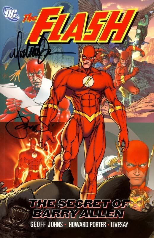 Further evidence: the cover to some trade of Flash that I didn’t read but conveniently found on Google.
Again, what the hell is the deal with this tiny waist and then upper body hulking atop it? Does Turner have a tiny waist fetish? Does he not know anatomy? I mean, I love weird, off-the-wall art. I love exaggerated art. It’s part of what makes comics. But I don’t love characters drawn in that super-crisp realistic style only to have their proportions totally out of whack.
Beyond that, the Flash cover is poorly composed, a fault that at least the Supergirl cover didn’t share.
So why does he continue to get work, especially at this rate? Anyone know? Is he way more popular than I realize? The Civil War cover, I’ll admit, was pretty strong, though I was far less than impressed by the initial inks.
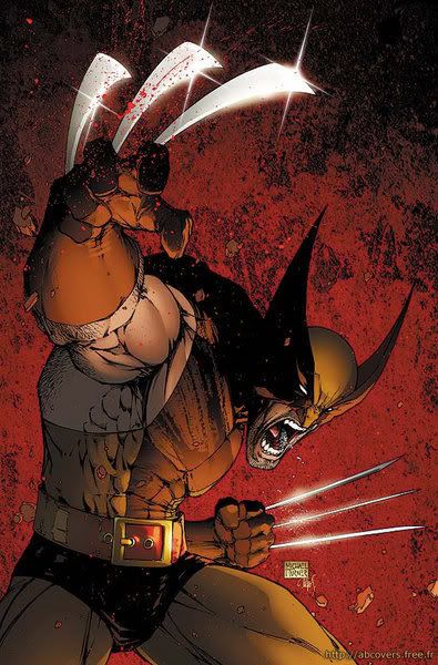 And, to his credit, Turner has done some strong work. Not surprisingly, there’s no females in sight.
The alternate cover to the first Wolverine: Origin is strong. It’s a fun, abstract, dark take on one of the favorite heroes and implies emotion that’s far too often lacking in Turner’s robotic work. But, it’s one good one. In baseball terms, that ain’t even within a sniff of the Mendoza line.